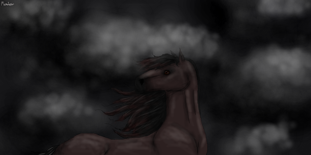
Twas a Dark and Stormy Night
| Twas a Dark and Stormy Night 1 |
|
|
#85414 Posted on 2017-01-04 20:24:14
0 members like this post.
|
Posted By ♫ℳℯâºâˆ‚â„´âµâ™« #103588 Member is Offline 75 forum posts Send A Message |
|
#85442 Posted on 2017-01-04 22:13:47
I would try using a slightly lighter colored horse for the example, as a dark one is hard to see. Also, shading seems to have the light source coming from two different directions, the right and left top corners. you'll want to decide what direction the light is coming from before shading.
0 members like this post.
|
Posted By SilverWolves♥♥♥ #104148 Member is Offline 579 forum posts Send A Message |
|
#85445 Posted on 2017-01-04 22:19:54
I wanted the darkness to give it a more blended effect, and the light to be coming all around as it peeked through the clouds, but I see where it looks like it went wrong. Thank you!
0 members like this post.
|
Posted By ♫ℳℯâºâˆ‚â„´âµâ™« #103588 Member is Offline 75 forum posts Send A Message |
|
#85450 Posted on 2017-01-04 22:27:37
I'd make the light source directly above then, as that is how light seems to reflect on really cloudy days.
0 members like this post.
|
Posted By SilverWolves♥♥♥ #104148 Member is Offline 579 forum posts Send A Message |
|
#85536 Posted on 2017-01-05 12:41:13
Thank you for the tip! Would you say this is at least acceptable for one who has about a week of experience with drawing horses using a mouse? That's my situation right now. Luckily, Youtube has many videos on horse anatomy.
0 members like this post.
|
Posted By ♫ℳℯâºâˆ‚â„´âµâ™« #103588 Member is Offline 75 forum posts Send A Message |
|
#85547 Posted on 2017-01-05 13:19:08
I like the dark color tbh.
0 members like this post.
|
Posted By Raptor #79219 Member is Offline 7244 forum posts Send A Message |
|
#85550 Posted on 2017-01-05 13:26:07
SilverWolves is right about the lack of color, however, so I added lightning as an attention grabber in the midst of all the darkness.
0 members like this post.
|
Posted By ♫ℳℯâºâˆ‚â„´âµâ™« #103588 Member is Offline 75 forum posts Send A Message |
|
#85558 Posted on 2017-01-05 14:19:17
If you add lightning, just remember that it becomes your light source. Light would be coming from wherever there is a lightning bolt. (solves the lighting problem too)
0 members like this post.
|
Posted By SilverWolves♥♥♥ #104148 Member is Offline 579 forum posts Send A Message |
|
#85561 Posted on 2017-01-05 14:34:45
Yeah, I was hoping if I put lightning almost right beside, it would look more natural. ^^
0 members like this post.
|
Posted By ♫ℳℯâºâˆ‚â„´âµâ™« #103588 Member is Offline 75 forum posts Send A Message |
|
#85566 Posted on 2017-01-05 15:02:01
I think it's looks great :D
0 members like this post.
|
Posted By #24715 Member is Offline 2288 forum posts Send A Message |
|
#85620 Posted on 2017-01-05 18:03:59
@Wonder Wiki
1 members like this post.
|
Posted By ♫ℳℯâºâˆ‚â„´âµâ™« #103588 Member is Offline 75 forum posts Send A Message |
|
#85663 Posted on 2017-01-05 21:44:08
The shoulders and hindquarters aren't THAT round/defined. Also, if the horse was looking the way if was, the neck wouldn't be as slim and even.
0 members like this post.
|
Posted By LiesieAM #94081 Member is Offline 125 forum posts Send A Message |
|
#85965 Posted on 2017-01-07 08:24:54
This looks amazing! ♥
0 members like this post.
|
Posted By oswin • hiatus #80380 Member is Offline 6646 forum posts Send A Message |
|
#86095 Posted on 2017-01-07 16:47:42
Ahh, thank you! ♥
0 members like this post.
|
Posted By ♫ℳℯâºâˆ‚â„´âµâ™« #103588 Member is Offline 75 forum posts Send A Message |
1 |
|

