Critique please!
| Critique please! 1 |
|
|
#78936 Posted on 2016-12-10 04:02:59
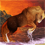
So, I've just finished this and want to see if I can improve it?
0 members like this post.
|
Posted By Ûµ Pegasusdreamer Ûµ #93994 Member is Offline 1323 forum posts Send A Message |
|
#78973 Posted on 2016-12-10 09:14:55
It's a nice start, but I suggest next time creating a new layer for the colour, instead of filling directly on the lineart layer. If you have the colour layer under the lineart, you avoid having all those white dots on the lines. I also suggest using a harder brush on this. The brush you used looks quite soft and feathery? I guess that's what you could call it. That's another thing making the lineart look like this.
0 members like this post.
|
Posted By Siren #2811 Member is Offline 2129 forum posts Send A Message |
|
#78995 Posted on 2016-12-10 10:31:55
Looks great, Pegasus. In addition to the excellent points Siren made, I also find that when you use a straight white, it can later wash out the grayscale underneath that region when people recolor the character/design. To prevent this, people will often use a slight variation of the white color (maybe a bit of a gray-white, or a creamy-white). It still looks white, but colors better over many grayscales without losing the grayscale detail underneath the white :)
0 members like this post.
|
Posted By Frosted Mint #55638 Member is Offline 821 forum posts Send A Message |
|
#78997 Posted on 2016-12-10 10:34:29
Thanks for the feedback!
0 members like this post.
|
Posted By Ûµ Pegasusdreamer Ûµ #93994 Member is Offline 1323 forum posts Send A Message |
1 |
|


