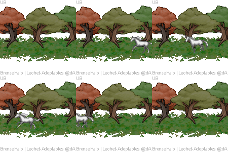
forest run animation
| forest run animation | |
|
#74095 Posted on 2016-11-01 03:15:06
v1:
2 members like this post.
|
Posted By UlyssesBlue (spare) #75110 Member is Offline 559 forum posts Send A Message |
|
#74107 Posted on 2016-11-01 07:47:19
i think it looks good but the horse is a little to small in my opinion. i think how busy and how the background is moving takes the attention from the horse and it is kind of hard to notice. but other that that it looks great!!!!!
0 members like this post.
|
Posted By ʟᴀɴᴇʏ #64834 Member is Offline 2448 forum posts Send A Message |
|
#74124 Posted on 2016-11-01 10:39:41
I love it!
0 members like this post.
|
Posted By insomniaglet #64633 Member is Offline 1693 forum posts Send A Message |
|
#74139 Posted on 2016-11-01 12:43:36
I'd buy one..!
0 members like this post.
|
Posted By Raptor II #85876 Member is Offline 4 forum posts Send A Message |
|
#74143 Posted on 2016-11-01 13:04:21
super cool! buuut what's with the pink tree? ;P
0 members like this post.
|
Posted By ₸ϻɌa͎n͎c͎h͎ #31174 Member is Offline 2279 forum posts Send A Message |
|
#74145 Posted on 2016-11-01 13:08:40
maybe a cherry tree? dunno lol
0 members like this post.
|
Posted By Raptor #79219 Member is Offline 7244 forum posts Send A Message |
|
#74212 Posted on 2016-11-02 08:54:36
I really like it! The only thing that gets me is the trees, the animation is just a tad choppy and I think it would help the horse stand out a little if the trees were a little faded.
0 members like this post.
|
Posted By #35396 Member is Offline 706 forum posts Send A Message |
|
#74298 Posted on 2016-11-02 18:24:21
Right now, my attention doesn't really immediately go to the horse, more so to the trees, as Ruby said so I agree that maybe you could somehow decrease the attention-grabbing factor of them. I'm also not quite sure how I feel about the ground tapering off into blank space. Other than that, it's really good!
0 members like this post.
|
Posted By Reign #68569 Member is Offline 503 forum posts Send A Message |
|
#74803 Posted on 2016-11-06 20:03:06
I think it's adorable! I would like the horse to stand out a bit more, but maybe once you've colored the horse it will. I'd buy at least one of these right now if possible!
0 members like this post.
|
Posted By Valzed â¤ï¸ 🀠🀠#87263 Member is Offline 1338 forum posts Send A Message |
|
#74830 Posted on 2016-11-06 23:06:35
Thanks so much for all your feedback, guys! Sorry it's taken me so long to reply, I've had a few all-nighters recently so haven't been on much. In response to some of your feedback:
0 members like this post.
|
Posted By UlyssesBlue (spare) #75110 Member is Offline 559 forum posts Send A Message |
|
#74837 Posted on 2016-11-07 00:01:27
I think this is amazing!
0 members like this post.
|
Posted By ~PurpleMagic~ #95369 Member is Offline 1322 forum posts Send A Message |
|
#74841 Posted on 2016-11-07 01:29:19
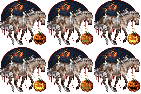
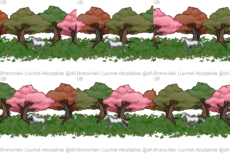
I've made a new version with a static background. What does everyone think of this? Does this address the issues raised about background dominance? Which version do you prefer?
0 members like this post.
|
Posted By UlyssesBlue (spare) #75110 Member is Offline 559 forum posts Send A Message |
|
#74856 Posted on 2016-11-07 07:47:31
I think I like v2 better as the trees in v1 still tend to draw the eyes first and not the horse. The only thing I would change about v2 is I would add a longer pause between when the horse "leaves" the scene and then "re-enters" the scene.
0 members like this post.
|
Posted By #35396 Member is Offline 706 forum posts Send A Message |
|
#74908 Posted on 2016-11-07 15:13:16
I love v1 still; dominating bgs have never really bothered me too much. But I like v2 also.
0 members like this post.
|
Posted By insomniaglet #64633 Member is Offline 1693 forum posts Send A Message |
|
#74940 Posted on 2016-11-07 20:04:27
I like V2 a lot! The horse definitely draws the attention with it being the only thing moving.
0 members like this post.
|
Posted By Reign #68569 Member is Offline 503 forum posts Send A Message |

 v2:
v2: 