Interest Check
| Interest Check 1 |
|
|
#73066 Posted on 2016-10-23 15:05:24
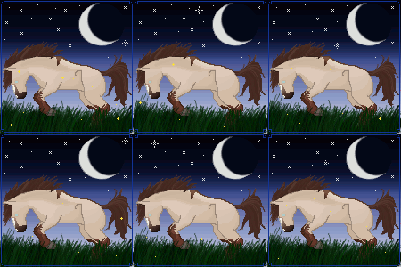
So I've been working on my art lately; and finally have a tag that I think might be worth selling. My last two tag sells had little interest; so before trying to sell this one I wanted to see if there would be any interest in this new style.  canyon eagle I want to change it a little and make fireflies be in the foreground too. Credits will be added, but horse sketch by FluffShady and all the rest by yours truly. Feel free to offer critiques; this is my first attempt at a tag in this style. UDATED VERSION:  canyon eagle or  canyon eagle Using the critique offered by SilverWolves I've completely re-done the background to more accurately reflect the style of the horses. I've done away with the fireflies for now, but they might be added back in later. I have two versions right now; let me know what you think and which you prefer. I think that I might like the second version better. UPDATE 2: now with fireflies  canyon eagle Last edited on 2016-10-24 at 10:34:36 by insomniaglet
0 members like this post.
|
Posted By insomniaglet #64633 Member is Offline 1693 forum posts Send A Message |
|
#73109 Posted on 2016-10-23 20:19:57
Well, I can't buy tags (I'm too broke for that, all my money has to go to sims pons) I can offer slight critique. My only critique is that the art style of the horse and the art style of the background look like two different art styles, so they don't completely merge together. It shows that they are done by two different artists.
0 members like this post.
|
Posted By SilverWolves♥♥♥ #104148 Member is Offline 579 forum posts Send A Message |
|
#73110 Posted on 2016-10-23 20:44:03
I did the background and the horse; so they are by the same artist ;) The only thing not by me was a vague sketch of the horse number twelve for sell here which I bought and used because I stink at horse anatomy. I made the background about 5 months ago and did the horse in the last few days so that maybe why the two styles appear so different? idk
0 members like this post.
|
Posted By insomniaglet #64633 Member is Offline 1693 forum posts Send A Message |
|
#73116 Posted on 2016-10-23 21:50:15
I think the biggest difference is that the horse has a very geometric shape and light shading, while the background has a much darker shade, and is more curvy with the grass shading.
0 members like this post.
|
Posted By SilverWolves♥♥♥ #104148 Member is Offline 579 forum posts Send A Message |
1 |
|


