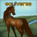
very first manip?
| very first manip? 1 |
|
|
#51412 Posted on 2016-07-06 20:14:04
so this is the first manip i have ever attempted and ended up finishing. i dont think its that bad but i want to improve!
0 members like this post.
|
Posted By ʟᴀɴᴇʏ #64834 Member is Offline 2448 forum posts Send A Message |
|
#51454 Posted on 2016-07-07 06:07:45
It's good. To improve, I would add a faded but not too faded reflection of the horse in the water. the water seems pretty deep because of how slanted the sand is into the water, so I would put the horse in between the hock and knee. Lastly, ripples. You don't have to do a whole lot of those as the horse is just standing there but ripples are a nice touch. (I you can't do ripples yourself, there's free to use brushes on dA)
0 members like this post.
|
Posted By ₸ϻɌa͎n͎c͎h͎ #31174 Member is Offline 2279 forum posts Send A Message |
|
#51465 Posted on 2016-07-07 06:17:18
I meant to add ripples but i couldnt find the right tool to do it so this should help a lot. Thanks!
0 members like this post.
|
Posted By ʟᴀɴᴇʏ #64834 Member is Offline 2448 forum posts Send A Message |
|
#51470 Posted on 2016-07-07 06:22:33
Found you some ripple brushes
0 members like this post.
|
Posted By ₸ϻɌa͎n͎c͎h͎ #31174 Member is Offline 2279 forum posts Send A Message |
|
#51471 Posted on 2016-07-07 06:25:46
Thanks I'm gonna use them
0 members like this post.
|
Posted By ʟᴀɴᴇʏ #64834 Member is Offline 2448 forum posts Send A Message |
|
#52028 Posted on 2016-07-10 01:48:16
It looks great so far! Maybe add some ripples around the horses hooves, and the horses reflection.
0 members like this post.
|
Posted By Ûµ Pegasusdreamer Ûµ #93994 Member is Offline 1323 forum posts Send A Message |
|
#52046 Posted on 2016-07-10 05:32:54
I love the color of the horse you chose for the background, he/she really stands out, but maybe just a little too much. The trees overhead suggest that the hrose should have some sort of shadow on it, maybe just make him/her a little darker to blend in with the background better. BTW you changed the horses eye color wonderfully, it is not an awkward color that makes it seem unreal. :3
0 members like this post.
|
Posted By Amarathine #79720 Member is Offline 317 forum posts Send A Message |
1 |
|


