Critique... Help?
| Critique... Help? 1 |
|
|
#26052 Posted on 2016-04-02 18:13:04
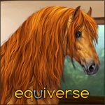
First ever digital coloring using some free lineart...
0 members like this post.
|
Posted By Cast #52485 Member is Offline 496 forum posts Send A Message |
|
#26078 Posted on 2016-04-02 19:05:43
wont let me post both pics in the original post...
0 members like this post.
|
Posted By Cast #52485 Member is Offline 496 forum posts Send A Message |
|
#26216 Posted on 2016-04-02 23:36:59
I like it, it looks a tad messy though. Maybe do it completely grey, then change the colour to how you like it.
1 members like this post.
|
Posted By Malibu Estate #77601 Member is Offline 601 forum posts Send A Message |
|
#26217 Posted on 2016-04-02 23:43:28
I love the first one!!
1 members like this post.
|
Posted By ~PurpleMagic~ #95369 Member is Offline 1322 forum posts Send A Message |
|
#26284 Posted on 2016-04-03 08:51:02
@ Magic is Awesome
0 members like this post.
|
Posted By Cast #52485 Member is Offline 496 forum posts Send A Message |
|
#26307 Posted on 2016-04-03 10:17:44
I think the first one it's lines are not high enough quality... It just seems off to me... I don't know how to explain it...
1 members like this post.
|
Posted By Zpya #96945 Member is Offline 51 forum posts Send A Message |
|
#26342 Posted on 2016-04-03 12:52:41
i use krita as well and if you would like I could pm you with some tips on coloring and layers?
1 members like this post.
|
Posted By Silver #94375 Member is Offline 408 forum posts Send A Message |
|
#26399 Posted on 2016-04-03 14:38:18
@ Silver, that would be amazing!!
0 members like this post.
|
Posted By Cast #52485 Member is Offline 496 forum posts Send A Message |
|
#26458 Posted on 2016-04-03 17:54:52
Ok more playing....
0 members like this post.
|
Posted By Cast #52485 Member is Offline 496 forum posts Send A Message |
|
#26498 Posted on 2016-04-03 19:12:55
And another pixel pony
0 members like this post.
|
Posted By Cast #52485 Member is Offline 496 forum posts Send A Message |
|
#33746 Posted on 2016-04-25 03:36:36
Uhhohohohhoooohhhohohohoh!!
1 members like this post.
|
Posted By Foxglove #98464 Member is Offline 170 forum posts Send A Message |
|
#33889 Posted on 2016-04-25 13:28:45
Thank you Oshiah!!
0 members like this post.
|
Posted By Cast #52485 Member is Offline 496 forum posts Send A Message |
|
#33896 Posted on 2016-04-25 13:35:09
For the top, Some of the mane isn't coloured, so that makes it look unfinished.
0 members like this post.
|
Posted By Malibu Estate #77601 Member is Offline 601 forum posts Send A Message |
1 |
|


