Manip
| Manip 1 |
|
|
#22466 Posted on 2016-03-23 22:27:44
I have not made a manip in years. please keep this in mind.
0 members like this post.
|
Posted By ♫Bashƒul.Cupcake♫ #23923 Member is Offline 614 forum posts Send A Message |
|
#22551 Posted on 2016-03-24 08:13:05
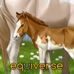
The lighting is very off in this picture, though I don't know exactly what. Perhaps lighten the horse some where the light is coming from. The horse also seems too dark for the photo. Also, the background seems ( at least, to me) too saturated. The hair isn't bad. It looks plain to see it was painted, though, but you'll get that anywhere anyways. The wrap on the horse's tail has no shading where it needs. Yes It has shading to show it's a tail wrap, but it has nothing beyond that and looks really flat. Your blending of the horse's hooves/legs into the background is good, but maybe blur it ever so slightly to it isn't as sharp. This is all the help I can give to you.
0 members like this post.
|
Posted By Bela #25298 Member is Offline 1821 forum posts Send A Message |
|
#22629 Posted on 2016-03-24 12:25:23
I really like this, but what exactly is that on the bottom of the far hind leg? XD
0 members like this post.
|
Posted By Malibu Estate #77601 Member is Offline 601 forum posts Send A Message |
|
#22631 Posted on 2016-03-24 12:34:19
Izzy :D
0 members like this post.
|
Posted By Arty ~🤎~ #25282 Member is Offline 663 forum posts Send A Message |
|
#22678 Posted on 2016-03-24 14:29:16
Bela - I agree that the lighting is off. I think the sky is too bright. I'm working with a completely new program and haven't explored it enough yet to figure out how to make the sky dark.
0 members like this post.
|
Posted By ♫Bashƒul.Cupcake♫ #23923 Member is Offline 614 forum posts Send A Message |
|
#22938 Posted on 2016-03-25 09:11:41
when recoloring a horse remember you're going to have to manually make the lighting match because a recolor makes the horse look super flat like shown. What I do is use the dodge/burn tools on misc settings to try and get it to match as well as repaint over a majority of the horse. The markings look a bit weird too but that just takes practice. Also, the mane and tail look a bit flat. Awesome of you to paint them in at all though as so many people dont even bother, just give them a bit more of a hair like texture. There's like a million tutorials on dA for that.
0 members like this post.
|
Posted By Shinku #44201 Member is Offline 193 forum posts Send A Message |
1 |
|


