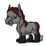
| What's so wrong with this? |
|
#14282 Posted on 2016-03-03 11:16:33
I've been drawing for... well, for forever it feels like. You know when I actually got good enough to be proud of what I was drawing? -- a year ago. Before then, maybe one of twenty or thirty things was good enough that I would personally like it.
It takes time, and endless amounts of practice. I do two, sometimes three sketches to get my lines to where I want them before I do a final outline, and half the time I don't like the outline until it's greyscaled and colored.
Art is not something that's made to be perfect, it can be messy. Something that looks terrible to you can look amazing to someone else. Seriously, there are no mistakes in art, only practice. Like pretty much everyone above has said, look at horse anatomy. Trace the general lines of horses, break horses down into shapes, learn the musculature beneath the skin. I'm one of the people that are incredibly picky over both my own art and art other people make that I want to buy.
You want to know where I started? Here. And here. And here.
That was five-six years ago. No, I didn't work on only digital art in that time, but I learned a lot more about composition, and practiced. Now I can do things like this. You learn and grow as an artist. Two years from now I'll probably be using that picture as an "oh my goodness, look how far I've come." Art is not, and will never be, and overnight process. It's hard work!
0 members like this post.
|
Posted By

Nittrous
#93632
 
Member is Offline
823 forum posts
Send A Message
|
|
#14293 Posted on 2016-03-03 11:43:21
Your biggest issue is anatomy.
The back is too short compared to the belly, the head is too short, the ears are too big for the head. The legs are too thin and the hind legs are too tucked up under the horse.
0 members like this post.

|
Posted By
Kuk
#29490

Member is Offline
314 forum posts
Send A Message
|
|
#14301 Posted on 2016-03-03 12:03:20
All of the above, plus it kinda...just looks like a draft horse.
You need a size chart or something extra to make it seem MINIATURE. It looks like any other draft currently.
0 members like this post.
|
Posted By
Bruce Willis
#96868
 
Member is Offline
863 forum posts
Send A Message
|
|
#14302 Posted on 2016-03-03 12:04:50
Just work on that anatomy :D I'll buy any art I like, in any style as long as the anatomy is good. I use skeleton referencing - you know, using circles and shapes and stuff, and it really helps me!
Also, I think there are a few miniature draft breeds about on DA already, so maybe its just that people have already brought some similar ones elsewhere c:
0 members like this post.
|
Posted By

Hoofie
#28575

Member is Offline
312 forum posts
Send A Message
|
|
#14477 Posted on 2016-03-03 16:48:10
Hey Megan,
I never read other comments so this is likely repetitive, but a couple things are
1) the horse looks more drafty than miniature. If you lengthen the body a bit, shorten the legs a bit and thin their size down, and narrow the head a bit, it might help
2) the legs need more shape. Look at photos of horses' legs to get the idea of the bone anatomy
3) the eye is a bit too small and more human shaped than horse shaped. I'd move the eye position up a bit, make it larger in size, and look again at horse photos to get an idea of the shape of the eye, as well as the pupil (pupil is rectangular).
4) I really like your coloring style! You have a good grasp on how to use the brushes to give the illusion of a coat/hair strands :)
0 members like this post.

|
Posted By

Frosted Mint
#55638
 
Member is Offline
821 forum posts
Send A Message
|
|
#14558 Posted on 2016-03-03 19:26:20
I have only read a little of the posts... Sorry if I have repeated anything.
I just wanted to say this is a great start. Not everyone's art is going to be perfect. I promise you that. There are some errors that you will probably need to work on in the drawing itself based off of proportions mostly. The legs are a little close together, and the hooves are pretty small compared to the body. What you want to think is if that horse were a real horse, would it be able to stand. I also noticed the ears a pretty big. Some other things such as the eye is a little droopy, but that is only based off of what type of style of art your going for. I usually draw cartoonist things, but I can draw some very realistic horses. Horses are my specialitie when it comes to drawing them. I would be happy to help you and show you some of my art. Perhaps make you something to work off of? Anyway, back to the claim. I wanted to point out that your coloring is magnificent. It looks like you spent a lot of time in the whole thing all together. I like it, and I might have bought it if I knew what the price was. Maybe no one bought it because the price was high? I haven't ever seen it till now. I think that all you need to work on is proportions all together, that is pretty much it until you get to shading. It is pretty nice though. It is a great start. If you ask me it is a really great start and I think you would get a 23/25 on an drawing/color quiz.
0 members like this post.

|
Posted By

Aido
#94136

Member is Offline
344 forum posts
Send A Message
|
|
#14614 Posted on 2016-03-03 21:45:36
I have also only read a few of the posts but here's my two cents;
- Don't be too hard on yourself, good artwork comes with practice! (and not to mention patience)
-The fact that it is a miniature draft horse pretty much throws me through a loop. Draft horses are typically 15.2 and up.
-The confirmation is out of wack. His front legs are post legged, and his back legs have sickle hocks. His back is pretty short, but if you do end up re-doing it don't add too much back, drafts tend to have smaller backs. The hind quarters should be larger and rounder. It also looks as if he has a roman nose, which also may make or break a sale.And finally, confirmation wise, the hooves are far too small. I'm sure you didn't think about confirmation while designing this, but personally for me, even with my characters I make sure their confirmation is right :)
-The lines are a bit sketchy, not too smooth and high quality, as many of us look for.
Over all very nice work, and I would keep it up. Perhaps, if you can, invest in a drawing tablet? It makes your lines smoother and crisper. :)
0 members like this post.

|
Posted By

vampire valencia
#89889

Member is Offline
351 forum posts
Send A Message
|
|
#14716 Posted on 2016-03-04 05:36:49
I agree with you all on the hooves part as well, hooves and ears are my main struggle to get right. Especially the hoove of the hindleg is too tiny. I will continue working on this, but it may take some time before I post it again, since I am making something else as well.
I draw with a drawing tablet, so that isn't the problem with my lines, it's more that I just have a very shakey hand.
I will most probably redraw everything, the head is meant to be roman, because some drafts have that. I think the legs should also be shorter. In fact what I am trying to create is a Shetland Pony with heaps of feathers. I don't do art on DA, I just don't know how DA works, so it might be that there are miniature drafts on there.
Thank you all for your feedback, I appreciate it and in the further I will post a newer example of this and I will keep improving this breed untill it's near perfect and ready for sale, because it just wasn't before. Might take a few months though.
0 members like this post.

|
Posted By

megansparrow
#45453

Member is Offline
426 forum posts
Send A Message
|
|
#14949 Posted on 2016-03-04 14:55:27
Some art programs have auto smoothing on the lines which can help if you have a shakey hand.
0 members like this post.

|
Posted By

-❆--Buck
#53822
  
Member is Offline
1729 forum posts
Send A Message
|
|
