Spring
Currently...
- 2 members online
- 41,584 total members
- 959,655 total horses
- 2,032 total stables
Need objective opinions
| Need objective opinions 1 |
|
|
#121431 Posted on 2017-09-13 09:30:38
This:
0 members like this post.
|
Posted By Bela #25298 Member is Offline 1821 forum posts Send A Message |
|
#121434 Posted on 2017-09-13 09:42:01
I like the top two both equally! They have very different styles and I think you could use both, depending on your mood - more realistic and elegant, or modern and clean? However you are feeling at the time!
0 members like this post.
|
Posted By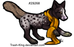 North #113155 Member is Offline 542 forum posts Send A Message |
|
#121436 Posted on 2017-09-13 09:51:14
Personally I don't think the abstract logo is a good fit, because it has a very analytical and sharp feeling to it - more like something that would represent perhaps an architectural firm than an artist. The silhouette one has a lot more spirit and freedom of line to it, and feels more fitting. I would play around more with the arrangement of the text and maybe nix the copyright symbol altogether (because it's implied if you're putting this on your work that it's by you). If it's absolutely necessary to include the text in some places you'll use this, perhaps make it smaller and stick it right under the logo. When it overlaps it may look more incorporated but it also dominates the image, which is working here as your brand.
0 members like this post.
|
Posted By #51565 Member is Offline 2607 forum posts Send A Message |
1 |
|
 Or this:

 For logos I just need other options because I stare at stuff too long. I'm thinking the top logo, I'm going to move the words to the bottom like the new logo or side like my picatro brand mark.
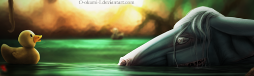

Contact Us Game Support Bug Zapper
Terms and Conditions Code of Conduct Privacy Policy
Game content & programming © equiverse.com 2006-2025 | An OCIA game